Introduction to Linear Regression
Linear Regression is a powerful modeling technique that can be used to understand the relationship between quantitative variable and one or more other variables, sometimes with the goal of making predictions. For example, linear regression can help us answer questions like:
-
What is the relationship between apartment size and rental price for NYC apartments?
-
Is a mother's height a good predictor of their child's adult height?
The first step before fitting a linear regression model is exploratory data analysis (EDA) and data visualization:
- Is there a relationship that we can model? For example, suppose we collect heights (in cm) and weights (in kg) for 9 adults and inspect a plot of height vs weight.
plt.scatter(data.height, data.weight)
plt.xlabel('height (cm)')
plt.ylabel('weight (kg)')
plt.show()
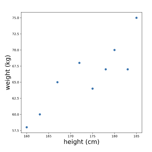
When we look at this plot, we see that there is some evidence of a relationship between height and weight: people who are taller tend to weigh more. In the following exercises, we’ll learn how to model this relationship with a line. If you were to draw a line through these points to describe the relationship between height and weight, what line would you draw?
import pandas as pd
import numpy as np
import matplotlib.pyplot as plt

# Read in the data
students = pd.read_csv('test_data.csv')

# Write equation for a line
y = 9.85 * students.hours_studied + 43

# Create the plot here:
plt.scatter(students.hours_studied, students.score)

plt.plot(students.hours_studied, y)
plt.show()
Equation of a line
Like the name implies, LINEar regression involves fitting a line to a set of data points. In order to fit a line, it's helpful to understand the equation for a line, which is often written as y=mx+b. In this equation:
-
xandyvariables, such as height and weight or hours of studying and quiz scores. -
brepresents they-interceptof the line. This is where the line intersects with the y-axis (a vertical line located at x=0). -
mrepresents theslopeof the line. This controls how steep the line is. If we choose any two points on a line, the slope is the ratio between the vertical and horizontal distance between those points; this is often written as rise/run.
The following plot shows a line with the equation y=2x+12.

Note that we can also have a line with a negative slope, such as y=-2x+12.
Finding the 'Best' Linear
A common choice for linear regression is ordinary least squares (OLS). In simple OLS regression, we assume that the relationship between two variables x and y can be modeled as:
y = mx + b + error
We define “best” as the line that minimizes the total squared error for all data points. This total squared error is called the loss function in machine learning. For example, consider the following plot:
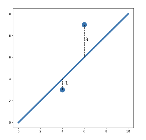
In this plot, we see two points on either side of a line. One of the points is one unit below the line (labeled -1). The other point is three units above the line (labeled 3). The total squared error (loss) is:
loss = (-1)^2 + 3^2 = 1 + 9 = 10
Notice that we square each individual distance so that points below and above the line contribute equally to loss (when we square a negative number, the result is positive). To find the best-fit line, we need to find the slope and intercept of the line that minimizes loss.
Python example:
# Load libraries
import pandas as pd
import numpy as np
import matplotlib.pyplot as plt
import statsmodels.api as sm

# Read in the data
students = pd.read_csv('test_data.csv')

# Create the model here:
model = sm.OLS.from_formula('score ~ hours_studied', data = students)

# Fit the model here:
results = model.fit()

# Print the coefficients here:
print(results.params)
# Output
Intercept        43.016014
hours_studied     9.848111
dtype: float64
Interpreting a Regression Model
Let’s again inspect the output for a regression that predicts weight based on height. The regression line looks something like this:
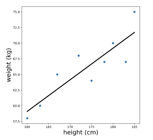
Note that the units of the intercept and slope of a regression line match the units of the original variables; the intercept of this line is measured in kg, and the slope is measured in kg/cm. To make sense of the intercept (which we calculated previously as -21.67 kg), let’s zoom out on this plot:
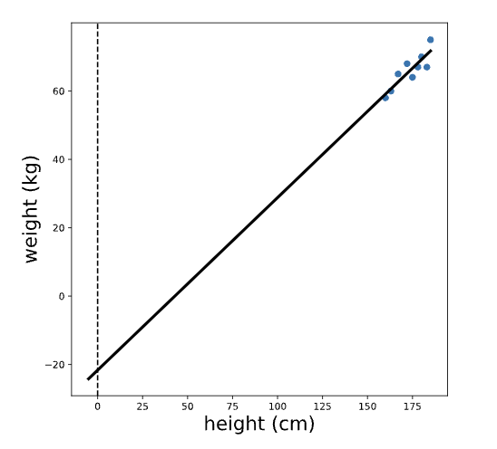
We see that the intercept is the predicted value of the outcome variable (weight) when the predictor variable (height) is equal to zero. In this case, the interpretation of the intercept is that a person who is 0 cm tall is expected to weigh -21 kg. This is pretty non-sensical because it’s impossible for someone to be 0 cm tall!
Remember that slope can be thought of as rise/run — the ratio between the vertical and horizontal distances between any two points on the line. Therefore, the slope (which we previously calculated to be 0.50 kg/cm) is the expected difference in the outcome variable (weight) for a one unit difference in the predictor variable (height). In other words, we expect that a one centimeter difference in height is associated with .5 additional kilograms of weight.
Note that the slope gives us two pieces of information: the magnitude AND the direction of the relationship between the x and y variables. For example, suppose we had instead fit a regression of weight with minutes of exercise per day as a predictor — and calculated a slope of -.1. We would interpret this to mean that people who exercise for one additional minute per day are expected to weigh 0.1 kg LESS.
Assumptions of Linear Regression Part 1
There are number of assumptions of simple linear regression, which are important to check if you are fitting a linear model. The first assumption is that the relationship between the outcome variable and the predictor is linear (can be described by a line). We can check this before fitting the regression by simply looking at a plot of the two variables.
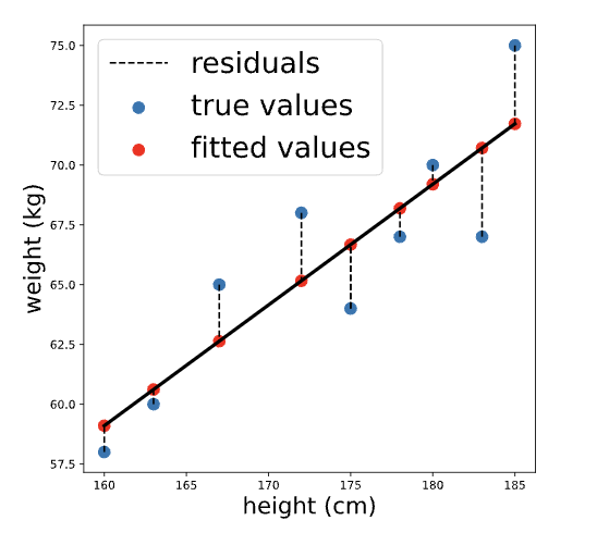
The next two assumptions (normality and homoscedasticity) are easier to check after fitting the regression. We will learn more about these assumptions in the following exercises, but first, we need to calculate two things: fitted values and residuals.
Again consider our regression model to predict weight based on height (model formula 'weight ~ height'). The fitted values are the predicted weights for each person in the dataset that was used to fit the model, while the residuals are the differences between the predicted weight and the true weight for each person. Visually:
We can calculate the fitted values using .predict() by passing in the original data. The result is a pandas series containing predicted values for each person in the original dataset:
fitted_values = results.predict(body_measurements)
print(fitted_values.head())

## Output

fitted_values = results.predict(body_measurements)
print(fitted_values.head())
The residuals are the differences between each of these fitted values and the true values of the outcome variable. They can be calculated by subtracting the fitted values from the actual values. We can perform this element-wise subtraction in Python by simply subtracting one python series from the other, as shown below:
residuals = body_measurements.weight - fitted_values
print(residuals.head())

# Output
0   -2.673077
1   -1.100962
2    3.278846
3   -3.711538
4    2.841346
dtype: float64
Normality Assumptions
The normality assumption states that the residuals should be normally distributed. This assumption is made because, statistically, the residuals of any independent dataset will approach a normal distribution when the dataset is large enough.
To check the normality assumption, we can inspect a histogram of the residuals and make sure that the distribution looks approximately normal (no skew or multiple “humps”):
plt.hist(residuals)
plt.show()
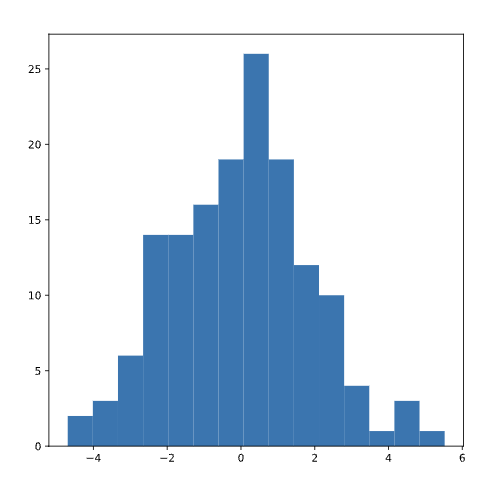
These residuals appear normally distributed, leading us to conclude that the normality assumption is satisfied.
If the plot instead looked something like the distribution below (which is skewed right), we would be concerned that the normality assumption is not met.
Homoscedasticity Assumptions
Homoscedasticity is a fancy way of saying that the residuals have equal variation across all values of the predictor (independent) variable. When homoscedasticity is not met, this is called heteroscedasticity, meaning that the variation in the size of the error term differs across the independent variable.
Since a linear regression seeks to minimize residuals and gives equal weight to all observations, heteroscedasticity can lead to bias in the results.
A common way to check this is by plotting the residuals against the fitted values.
plt.scatter(fitted_values, residuals)
plt.show()
If the homoscedasticity assumption is met, then this plot will look like a random splatter of points, centered around y=0 (as in the example above).
If there are any patterns or asymmetry, that would indicate the assumption is NOT met and linear regression may not be appropriate. For example:
Categorical Predictors
Important to note that we can also use categorical predictors in a linear regression model. The simple case of a categorical predictor is a binary variable (only two categories).
For example, suppose we surveyed 100 adults and asked them to report their height in cm and whether or not they play basketball. We’ve coded the variable bball_player so that it is equal to 1 if the person plays basketball and 0 if they do not. A plot of height vs. bball_player is below:
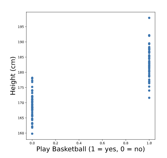
We see that people who play basketball tend to be taller than people who do not. Just like before, we can draw a line to fit these points.
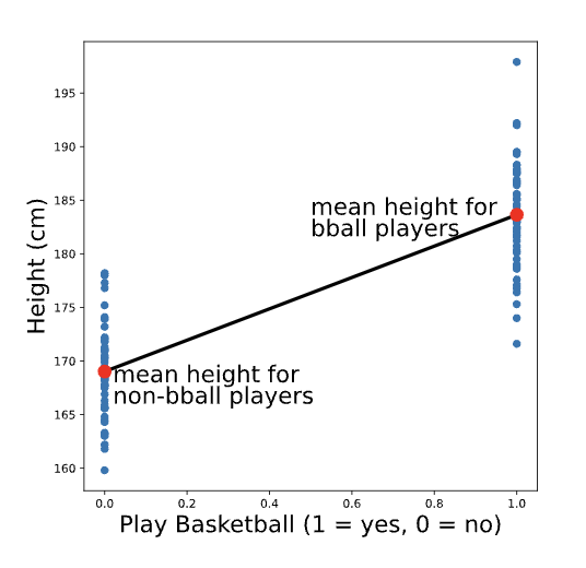
You might have guessed (correctly!) that the best fit line for this plot is the one that goes through the mean height for each group. To re-create the scatter plot with the best fit line, we could use the following code:
# Calculate group means
print(data.groupby('play_bball').mean().height)

# Output
0	169.016
1	183.644
# Create scatter plot
plt.scatter(data.play_bball, data.height)

# Add the line using calculated group means
plt.plot([0,1], [169.016, 183.644])

# Show the plot
plt.show()
This will output the following plot (without the additional labels or colors):
Linear Regression with Categorical Predictor
Linear regression is a machine learning technique that can be used to model relationship between quantitative variable and some other variable(s). Those other variables can be either quantitative (e.g. height or salary) or categorical (e.g., job industry or hair color). However, if we want to include categorical predictors in a lnear regression model, we need to treat them a little differently than quantitative variables.
Let's explore here the implementation and interpretation of a single categorical predictor with more than two categories.
DATA
As an example, we’ll use a dataset from StreetEasy that contains information about housing rentals in New York City. For now, we’ll only focus on two columns of this dataset:
rent: the rental price of each apartmentborough: the borough that the apartment is located in, with three possible values ('Manhattan', 'Brooklyn', 'Queens')
import pandas as pd
rentals = pd.read_csv('rentals.csv')
print(rentals.head(5))

# Output
     rent  borough
   0 5295  Brooklyn
   1 4020  Manhattan
   2 16000 Manhattan
THE X MATRIX
To understand how we can fit a regression model with a categorical predictor, it's useful to walk through what happens when we use statsmodels.api.OLS.from_formula() to create a model. When we pass a formula to this function like rent ~ borough, it actually creates a new data set, which we don't see. This new data set is often referred to as the X matrix, and it is used to fit the model.
When we use a quantitative predictor, the X matrix looks similar to the original data, but with an additional column of 1s in front (the reasoning behind this column of 1s is the subject of a future article — for now, no need to worry about it!). However, when we fit the model with a categorical predictor, something else happens: we end up with additional column(s) of 1s and 0s.
For example, let’s say we want to fit a regression predicting rent based on borough. We can see the X matrix for this model using patsy.dmatrices(), which is implemented behind the scenes in statsmodels:
import pandas as pd
import patsy

rentals = pd.read_csv('rentals.csv')
y, X = patsy.dmatrices('rent ~ borough', rentals)

# Print out the first 5 rows of X
print(X[0:5])

# Output
[[1. 0. 1]
  [1. 1. 0]
  [1. 1. 0]
  [1. 1. 0]
  [1. 0. 1]]
The first column is all 1s, just like we would get for a quantitative predictor; but the second two columns were formed based on the borough variable. Remember that the first five values of the borough column looked like this:
borough
Brooklyn
Manhattan
Manhattan
Queens
Queens
Note that the second column of the X matrix [0, 1, 1, 0, 0] is an indicator variable for Manhattan: it is equal to 1 where the value of borough is 'Manhattan' and 0 otherwise.
Meanwhile, the third column of the X matrix ([0, 0, 0, 1, 1]) is an indicator variable for Queens: it is equal to 1 where the value of borough is 'Queens' and 0 otherwise.
The X matrix does not contain an indicator variable for Brooklyn. That's because this data set only contains three possible values of borough: Brooklyn, Manhattan, and Queens.
In order to recreate the borough column, we only need to indicator columns - because any apartment that is not in Manhattan or Queens must be Brooklyn.
For example, the first row of the X matrix has 0s in both indicator columns, indicating that the apartment must be in Brooklyn. Mathematically, we say that a 'Brooklyn' indicator creates collinearity in the X matrix. In regular English: a 'Brooklyn' indicator does not add any new information.
Because 'Brooklyn' is missing from the X matrix, it is the reference category for this model.
IMPLEMENTATION AND interpretation
We can fit a linear regression model now using statsmodels and print out the model coefficients:
import statsmodels.api as sm
model = sm.OLS.from_formula('rent ~ borough', rentals).fit()
print(model.params)

# Output

Intercept               3327.403751
borough[T.Manhattan]    1811.536627
borough[T.Queens]       -811.256430
dtype: float64
In the output, we see two different slopes: one for borough[T.Manhattan] and one for borough[T.Queens], which are the two indicator variables we saw in the X matrix. We can use the intercept and two slopes to construct the following equation to predict rent:
rent = 3327.40 + 1811.54 * borough[T.Manhattan] - 811.26 * borough[T.Queens]
To understand and interpret this equation, we can construct separate equations for each borough:
Equation 1: Brooklyn
When an apartment is located in Brooklyn, both ** borough[T.Manhattan] and borough[T.Queens] are equal to 0. Therefore, the equation simplifies to:
rent = 3327.40 + 1811.54 * 0 - 811.26 * 0
rent = 3327.40
In other words, the intercept is the predicted (average) rental price for an apartment in Brooklyn (the reference category).
Equation 2: Manhattan
When an apartment is located in Manhattan, borough[T.Manhattan] is equal to 1 and borough[T.Queens] is equal to 0. Therefore, the equation simplifies to:
rent = 3327.40 + 1811.54 * 1 - 811.26 * 0
rent = 3327.40 + 1811.54
rent = 5138.94
We see that the predicted (average) rental price for an apartment in Manhattan is 3327.4 + 1811.5: the intercept (which is the average price in Brooklyn) plus the slope on borough[T.Manhattan]. We can therefore interpret the slope on borough[T.Manhattan] as the difference in average rental price between apartments in Brooklyn (the reference category) and Manhattan.
Equation 3: Queens
When an apartment is located in Queens, borough[T.Manhattan] is equal to 0 and borough[T.Queens] is equal to 1. Therefore, the equation simplifies to:
rent = 3327.40 + 1811.54 * 0 - 811.26 * 1
rent = 3327.40 - 811.26
rent = 2516.14
We see that the predicted (average) rental price for an apartment in Queens is 3327.4 - 811.3: the intercept (which is the average price in Brooklyn) plus the slope on borough[T.Queens] (which happens to be negative because Queens apartments are less expensive than Brooklyn apartments). We can therefore interpret the slope on borough[T.Queens] as the difference in average rental price between apartments in Brooklyn (the reference category) and Queens.
We can verify our understanding of all these coefficients by printing out the average rental prices by borough:
print(rentals.groupby('borough').mean())

# Output
          rent
borough
Brooklyn  3327.40
Manhattan 5138.94
Queens    2516.14
The average prices in each borough come out to the exact same values that we predicted based on the linear regression model! For now, this may seem like an overly complicated way to recover mean rental prices by borough, but it is important to understand how this works in order to build up more complex linear regression models in the future.
CHANGING THE REFERENCE CATEGORY
In the example above, we saw that 'Brooklyn' was the default reference category (because it comes first alphabetically), but we can easily change the reference category in the model as follows:
model = sm.OLS.from_formula('rent ~ C(borough, Treatment("Manhattan"))', rentals).fit()
print(model.params)

## Output
# Intercept 5138.940379
# C(borough, Treatment("Manhattan"))[T.Brooklyn]   -1811.536627
# C(borough, Treatment("Manhattan"))[T.Queens]     -2622.793057
# dtype: float64
In this example, the reference category is 'Manhattan'. Therefore, the intercept is the mean rental price in Manhattan, and the other slopes are the mean differences for Brooklyn and Queens in comparison to Manhattan.